Case Study - Personalized Electric Shopping
Dev Shack was brought on to iterate quickly with the Technical Founder to scope out, design, build, and launch their platform, featuring many custom advanced interactive D3 widgets.
- Client
- UtilityAnswer
- Year
- -
- Service
- Platform Development
Finding good engineers is hard, and Dev Shack stands out as one of the best. Matt and Mike both make sound decisions, collaborate and support other team members, and they move fast to deliver quality products.
Scope
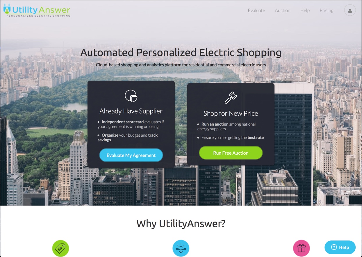
We worked closely with Jeffrey Farber to build an end-to-end experience that allowed users to shop for energy prices online and to compare an manage their utility bill. In a nutshell, it is like Mint for energy. The project involved building custom charts with complex data display requirements and itegrating them into an easy to use dashboard that tells the story of a user's energy usage and spending. The entire project consisted of a user dashboard for managing multiple meters, an auction and comparison page, and a checkout experience. Behind the scenes we worked with Jeff to synchronize energy usage data to the client and pull in data from multiple disparate sources.
Goals
Our primary focus was creating an experience that would educate users on the complex topic of energy pricing and utility bill management. As such, there were numerous iterations on the graphical and informational display components shown. The information needed to be displayed in a way that users could understand, which in turn would build trust in the UtilityAnswer brand.
Charts and Data
One of the challenging aspects of this project was creating highly interactive graphs. We wanted to control the charts with React's view abstraction layer while still having access to the power of D3.js. As a result we built a custom D3.js integration that all of the charts below are built on top of.
Above is an example of the auction landing page. The graph shows a the energy usage and monthly cost estimate of energy given a user's utility profile and their energy prices. It is compared to the energy price provided by the utility company. You can see in the demonstration above that changing plan terms automatically adjusts the graph to show the relevant time period, as well as highlights the active period.
Our flagship Timeline Widget had various modes depending on what kind of data was presented. Below is the data smoothening view which also showed the potential savings of an offered contract.
This graph was also capable of smoothly animating to show just the monthly cost or savings. In the example above, the bars are all red, but in many cases it would be a combination of savings during some months and losses during another.
Bill Analysis Tool
The Bill Analysis component pulled actual line-items from region specific utility bills into a unified and easy to read format. It demonstrated to the user where the savings (or losses) would come from in a way they could compare to their paper utility bills.
We went through multiple iterations of the various charts, tools, and widgets, trying to make them have all of the relevant and useful data while still being easy and intuitive to use without being overwhelming. An earlier version of the Bill Analysis Tool is shown below
Added Clarity
We created even more components to try to best explain how energy auction prices affected the users' bill. This component explains Supply vs Delivery, and the portions of each that make up the bill for any given month.
Account creation
The account creation flow required getting several pieces of important information from the user in order to generate an accurate price auction.
The above video demonstrates an early concept of the login flow. It evolved into the image below, which shows all of the steps to the user — making it easier to understand.
Auction Loading
Getting auction prices across energy distribution companies is a time consuming process. To convey that to the user we created an animated digital view into the auction, showing energy distributors competing to provide the user the lowest possible price. We were transparent about the number of bids collected across distributors and gave a preview of the savings (or losses).
We made several iterations to convey the process to the user in an easy to understand format, while the complicated queries and data processing happened behind the scenes.
Iteration 1: Proof of Concept
Iteration 2: Exploring a Podium paradigm
Iteration 3: Close to the final product
Conclusion
The UtilityAnswer project was a great experience that pushed our development skills forward. It challenged us to simplify complexity and focus on user experience in an industry that typically ignores it. We're proud to have worked alongside Jeff and are excited for what the future holds with UtilityAnswer.
- D3
- Flow
- React
- Meteor
Finding good engineers is hard, and Dev Shack stands out as one of the best. Mike and Matt worked on the launch of UtilityAnswer and helped us through various iterations of our interface. As a team, they compliment each other well. They both make sound decisions, collaborate and support other team members, and they move fast to deliver quality products. Mike has an extra sensitive eye for presentation and UI in brainstorming sessions, and Matt is able to handle complex code with ease. Individually, and as a team, they are able to traverse the full stack and they constantly maintain a pulse on new technology to advance their capabilities. I would highly recommend Dev Shack to technical and non-technical colleagues.

Founder and Technical Project Lead